
I have worked on several projects using the D3js library for visualization and interactivity. The header of this page (above) is a visualization of a quicksort algorithm based on HEX color values. These projects include geographical mapping (GIS), Voronoi diagrams, and visualizing disease within a populations where metadata could be extremely important.
Quick link to the code here!
Mapping Populations
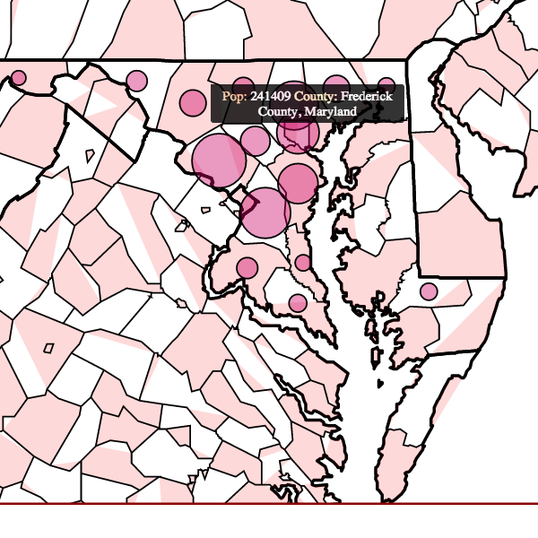
Using census data, I created an interactive map of the state of Maryland. The circles within each county represent relative population size at a given year. The user can click between multiple years - making the map re-create the circles based on the specified year’s census data. As shown in this figure, county metadata is shown as a tooltip (mouse over event).
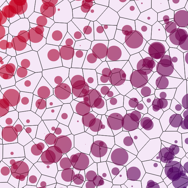
Voronoi
Voronoi diagrams are an interesting way to visualize the self-assemblage of territories within a population. I like to think of these diagrams as a way to see how randomly assorted points in a Euclidean landscape with high repulsion (i.e. they do not want to be around each other) can create an interesting map of territories with no higher-order rules governing the behavior.
With randomly generated points you may something that looks like this:
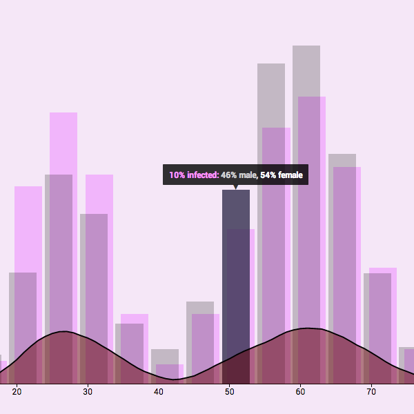
Diseased Populations
One of the most important aspects of analysis is really just visualizing data. Here I took a randomly created population of people with various ages and disease propensities. Then I subsampled this population for the simulated sample population. Using a Kernel Density Estimation and tooltips, I created histograms of both the sample and “real” populations along with a probability surface for individuals to have the disease.